While the timeless duo of black & white remains evergreen in the fashion realm, we can’t help but champion the cause of vibrant hues. It’s not about sidelining the classics, but rather embracing the spectrum of colours that offer versatility with a hint of intrigue, beyond the conventional beige.
To truly appreciate these modern-day neutrals, it’s essential to delve into the fascinating world of colour theory. Join us on this vibrant journey ahead!
Unraveling the Mystique of Colour Theory
Choosing the perfect colour combination might appear simple, but it’s an art and science in itself. Every hue, every shade, every tint has its place, ensuring that each element harmoniously complements the other.
Colours in design are not just randomly splashed; they are meticulously chosen, each with a distinct role to play. Whether it’s to bring unity to a design, highlight a particular section, or evoke a specific emotion, the allure lies in the palette’s balance.
Ever been intrigued by why certain colour duos seem so harmoniously paired, while others clash? Or why some shades seem to be a match made in aesthetic heaven, while others just don’t resonate? The credit, surprisingly, goes to the genius of Sir Isaac Newton. Yes, the very same luminary known for his gravitational theories! With the invention of the colour wheel, Newton provided a guiding light for designers and artists, simplifying the intricate dance of colours.
Understanding Neutral Hues
Neutrals are often considered the backbone of any colour palette. They don’t appear on the colour wheel because they aren’t derived from the primary, secondary, or tertiary colours. Instead, neutrals like black, white, grey, and sometimes brown and beige, are foundational colours that can either stand alone or serve as a backdrop for more vibrant shades.
These colours are termed “neutral” because they don’t typically compete or clash with other colours. They provide a calming balance in design and fashion, allowing other colours to shine or, when used alone, creating a minimalist, clean look.
Neutrals are versatile. They can be warm or cool, depending on their undertones. For instance, a beige might have a warm, yellow undertone, making it pair well with other warm colours. Conversely, a grey might have a cool, blue undertone, making it a perfect match with cooler shades.
In the realm of fashion and design, neutrals are often the unsung heroes. They provide depth, contrast, and relief, especially in designs that might otherwise be too busy or overwhelming. They’re the colours you turn to when you want sophistication, simplicity, or a touch of elegance.
In essence, while the colour wheel guides us in understanding the relationships and contrasts between vibrant hues, neutrals are the anchors that ground and harmonise our colour choices, ensuring a balanced and cohesive look.
Neutrals are often described as the “unsaturated” or “not intense” colours, but this doesn’t mean they lack significance or versatility. They serve as the foundation in design, fashion, and art, offering a calming and balancing effect amidst other more vibrant shades.
The beauty of neutral colours lies in their subtlety. They can effortlessly blend with almost any colour, providing a backdrop that allows other hues to stand out or offering a minimalist, understated elegance when used on their own. Their versatility is further enhanced by their range of undertones, which can lean towards warm or cool, adding depth and dimension even within the neutral palette.
For instance, a beige might look just beige at first glance. But upon closer inspection, it might reveal undertones of pink or peach, making it a warm beige. Similarly, a grey might seem straightforward, but it could have undertones of blue or green, classifying it as a cool grey.
This complexity within neutral colours is what makes them so valuable in design. They can adapt and shift based on their surroundings, complementing a wide array of colour schemes. Whether you’re aiming for a modern, sleek look with monochromatic neutrals or using them as a base to highlight bolder colours, neutrals are indispensable.
In essence, while they might be termed “neutral”, these colours are anything but bland. They offer a world of possibilities, each shade bringing its own unique character and charm to the table.
Exploring the Shades of Neutrality
Core Neutrals: These are the quintessential shades like blacks, whites, browns, and greys. Often referred to as “true colours,” they are saturated and devoid of any noticeable undertones. However, it’s essential to note that not every black, white, brown, or grey is inherently pure.
Adjacent Neutrals: Born from the union of a primary colour and a core neutral, these shades are termed “adjacent neutrals.” An example would be “tan,” derived from blending pure brown with primary yellow. These shades always exhibit a reduced saturation compared to core neutrals. When a neutral merges with a vivid shade, it amplifies the shade’s vibrancy, drawing attention to that specific colour segment.
Tonal Neutrals: Depending on the undertones, neutrals can be categorised as either “warm” or “cool.” Neutrals with undertones of yellow, orange, or pink result in shades like beige, tan, and gold, which are termed “warm neutrals.” Conversely, neutrals with blue, purple, or green undertones produce shades like grey, taupe, and ivory, known as “cool neutrals.” By integrating various core colours with primary ones, we can achieve these diverse tonal neutrals.
Neutral Colours in Jewellery Design
In the realm of jewellery, neutral colours play a pivotal role in creating timeless pieces that exude elegance and versatility. Just as in interior design, where neutral shades provide a backdrop that allows other elements to shine, in jewellery, these hues become the foundation upon which statement gems and intricate designs can stand out.
Consider a string of pearls against a black dress. The simplicity of the neutral backdrop accentuates the lustre and beauty of the pearls. Similarly, a diamond, with its clear and neutral sparkle, can be paired with any outfit, making it a staple in many jewellery collections.
Moreover, neutral-coloured gemstones like moonstone, smoky quartz, or labradorite have gained popularity for their ability to complement various metals, be it gold, silver, or rose gold. These stones, with their subtle hues, can be paired with brighter gemstones to create a harmonious balance in a piece of jewellery.
Furthermore, the rise of “greige” in the design world has found its echo in the jewellery industry too. This unique blend of grey and beige is sophisticated and contemporary, offering a fresh take on classic designs. It’s the perfect shade for those who want to stay within the realm of neutrals while still making a subtle statement.
In essence, the use of neutral colours in jewellery design allows for versatility and longevity. Whether you’re dressing up for a gala or opting for a casual brunch look, neutral-toned jewellery pieces can seamlessly elevate your style. They are the unsung heroes that provide balance, elegance, and a touch of sophistication to any ensemble.
What Colours Best Complement Me?
When considering a new jewellery investment, both budget and personal preferences are paramount, especially for bespoke items that offer a higher degree of customisation. Crafting a piece, be it a ring, necklace, or earring, is an intricate endeavour, factoring in various nuances that might not be immediately obvious.
Are you in search of a standout piece for special occasions? Or perhaps a versatile everyday accessory that effortlessly enhances your look? Much like fashion, the colours in our jewellery significantly influence our overall appearance. Certain hues accentuate our best features more than others, largely due to their interaction with our skin tone.
Determining whether your skin has a cool or warm undertone is straightforward. A simple trick involves holding a white paper beside your face and observing the reflection. A pinkish complexion suggests a cool undertone, while a more yellowish tint indicates a warm undertone. Additionally, your natural eye and hair colours offer clues about your inherent undertones. For instance, cool undertones often accompany green or blue eyes and ash blonde or jet-black hair. Conversely, warm undertones are associated with hazel, brown, or amber eyes and golden, auburn, or chestnut hair.
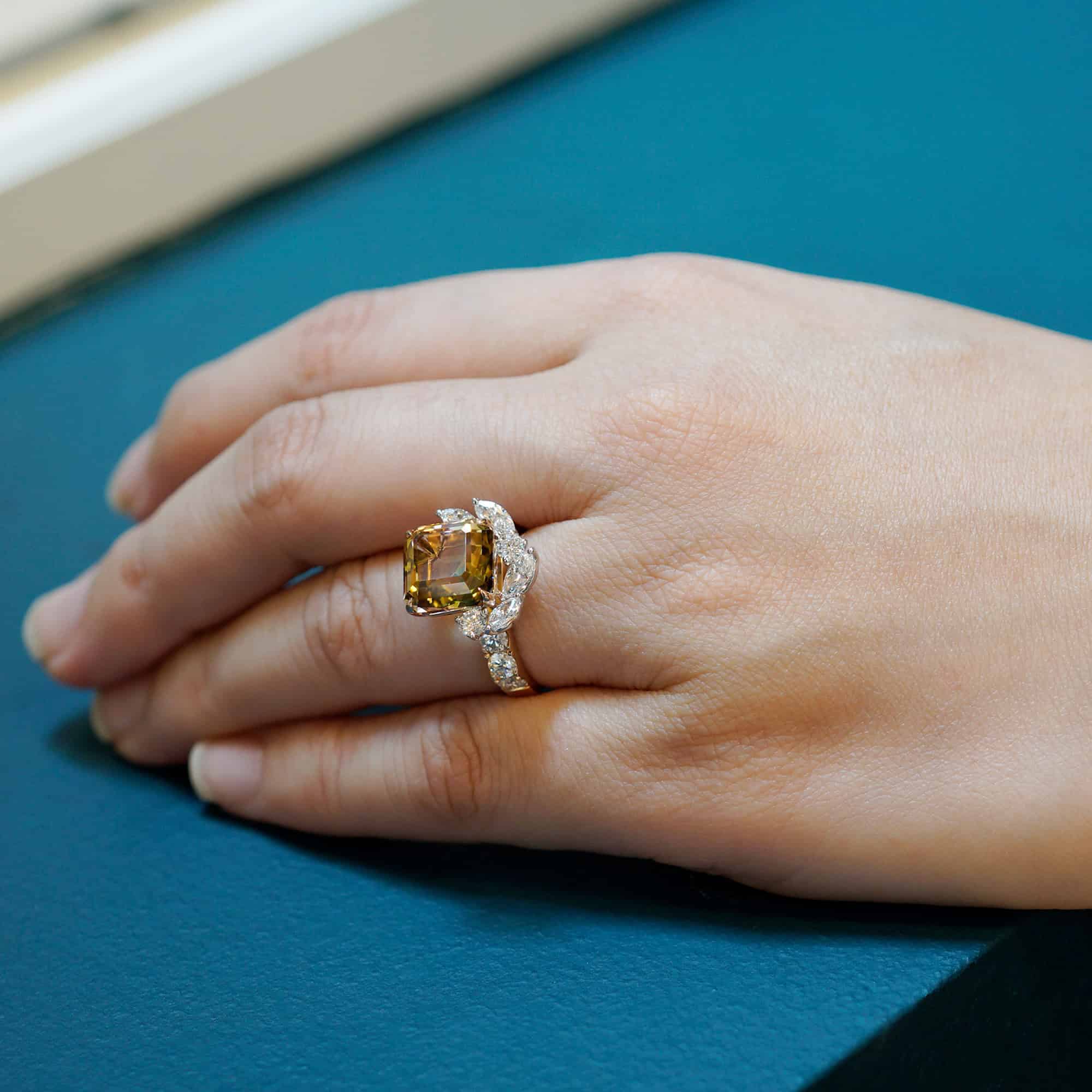
Generally, gemstones like emeralds, sapphires, rubies, and tanzanites in vibrant shades of pink, purple, red, blue, and green beautifully complement cool undertones. For those with warm undertones, gemstones in hues of yellow, orange, brown, neon green, and deep red, such as peridot, fire opal, mandarin garnet, or yellow topaz, are ideal.
However, steering our focus back to the core theme, let’s delve into the allure of neutral colours in jewellery.
Exploring Neutral Gemstones for Daily Wear
The perception of neutrals underwent a significant transformation in 2022, and this evolution continues to influence our choices today. As certain hues, once considered trendy or accent colours, have seamlessly integrated into our daily lives, they’ve earned the title of “neutrals”. This shift can be attributed to the ubiquity of these colours. Take, for instance, the rise of Pantone’s “Millennial Pink”. As it became omnipresent, its familiarity made it feel almost like a staple, leading many to view it as a neutral.
While the classics like black, white, and grey remain evergreen, depending on one’s undertones, the world of neutrals has expanded. So, as promised, let’s delve into five interesting neutral colours for creating fine jewellery:
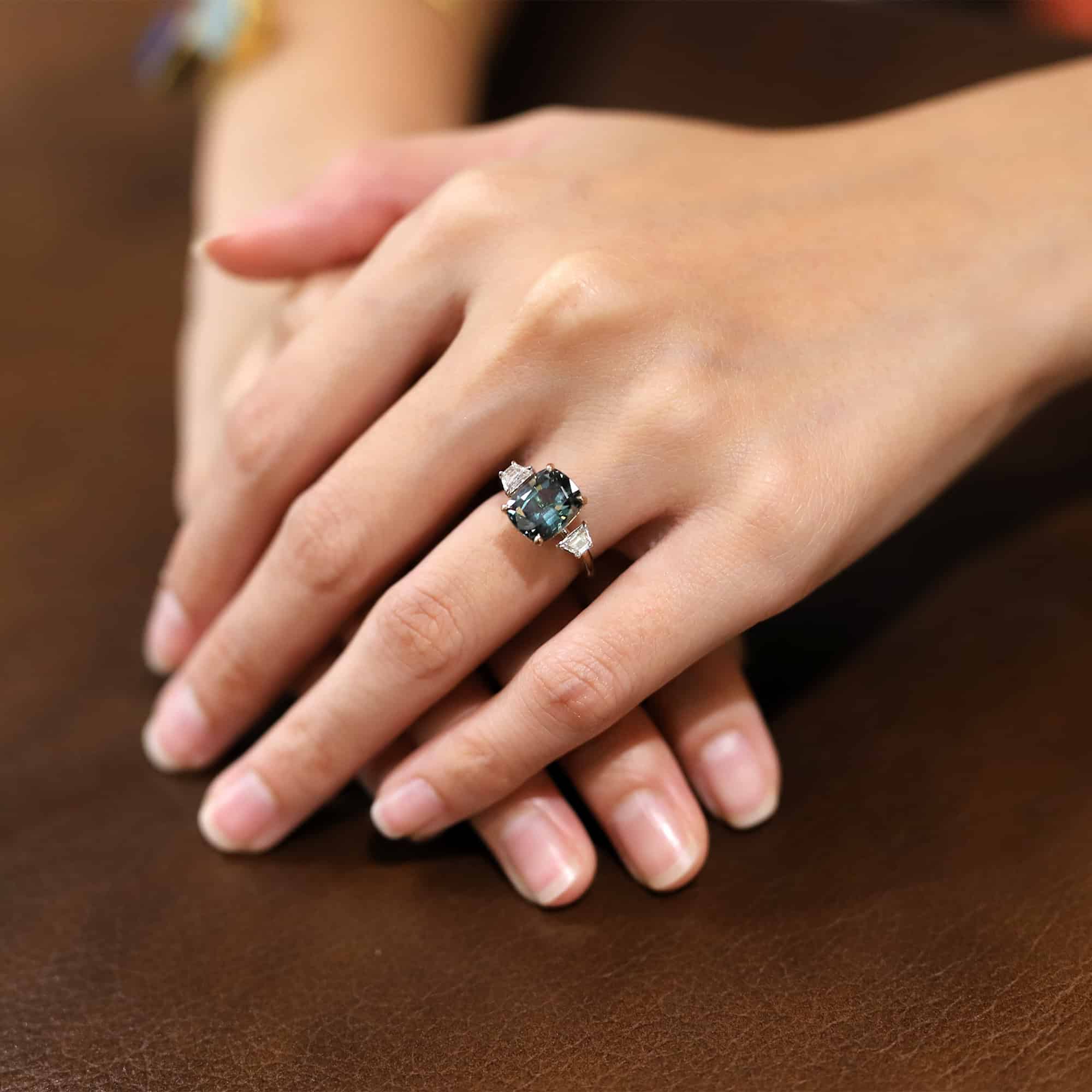
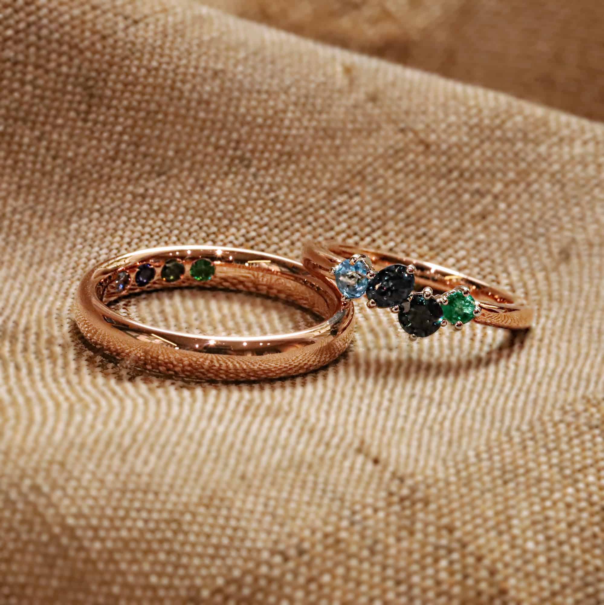
Indeed, Green as a Neutral: Nature’s Signature Hue
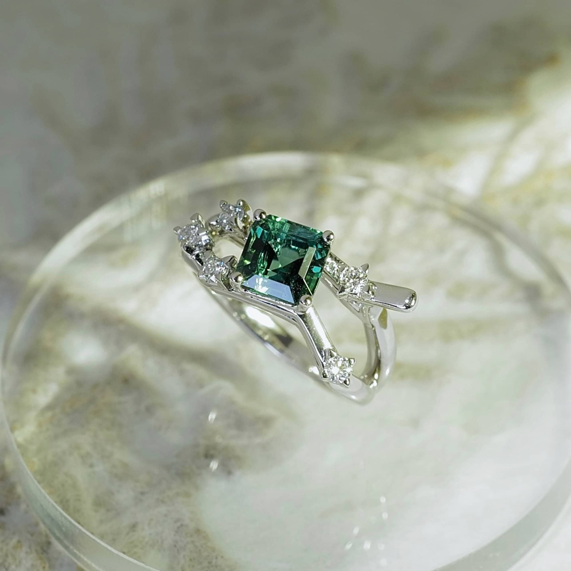
It might come as a surprise to many, but green, often associated with nature and vitality, is steadily making its mark as a neutral colour. Given its omnipresence in our surroundings, from lush forests to city parks, it’s no wonder that green feels so familiar and versatile.
When we talk about fashion or accessories, the right shade of green can be as adaptable as your classic blacks or whites. The key is to find a balanced green, one that doesn’t lean too heavily towards warm or cool undertones. This equilibrium ensures that the colour can seamlessly blend with a myriad of other hues, making it a staple in your wardrobe.
A pro tip for those looking to invest in gemstones: Tourmalines and Jades often come in this ideal shade of green. These gemstones not only capture the essence of nature but also offer that perfect neutral green that can elevate any outfit. So, the next time you’re contemplating adding a new piece to your collection, consider the understated elegance of green. It’s nature’s way of adding a touch of sophistication to your everyday look.
The Depth of Near-Blacks: A Modern Twist on a Classic
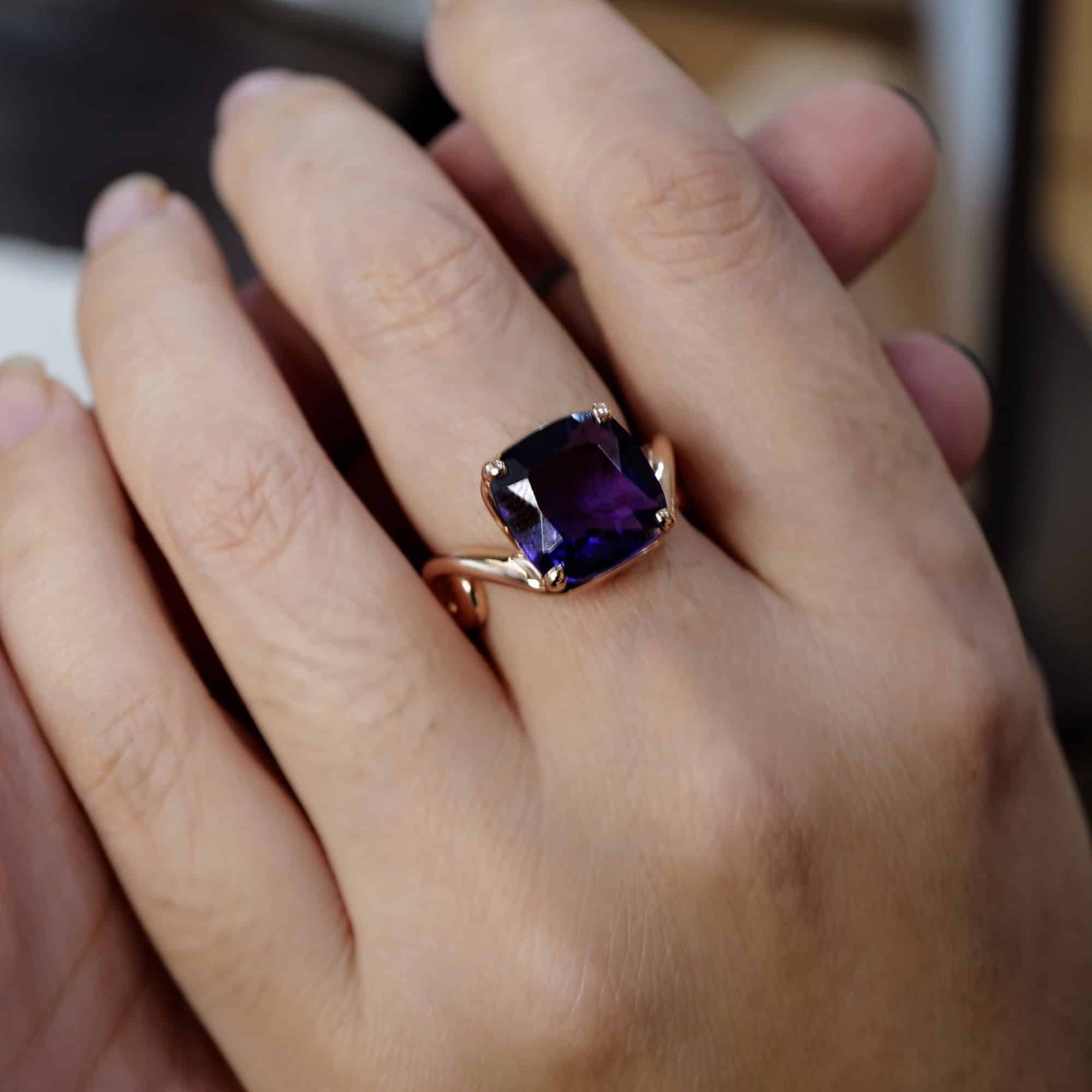
While pitch black remains a timeless and versatile choice for many, there’s a growing appreciation for hues that are just a shade away from absolute black. Imagine the darkest shades of purple, blue, and bordeaux; they possess an almost black base but with a subtle undertone of colour. This slight deviation from pure black adds a layer of depth and intrigue to the colour, making it more captivating.
These near-black shades, with their faint hints of red or blue, bring a contemporary twist to the classic black, offering a fresh perspective and a touch of sophistication. It’s no wonder that this trend is gaining traction in the fashion and design world.
For those looking to incorporate this trend into their jewellery collection, Amethysts and black sapphires are excellent choices. These gemstones capture the essence of the near-black trend, providing a unique blend of classic elegance and modern flair. So, if you’re in the mood for something that’s both familiar and novel, delve into the world of near-blacks. It’s a subtle yet impactful way to elevate your style.
Terracotta: The Unsung Hero of Neutrals
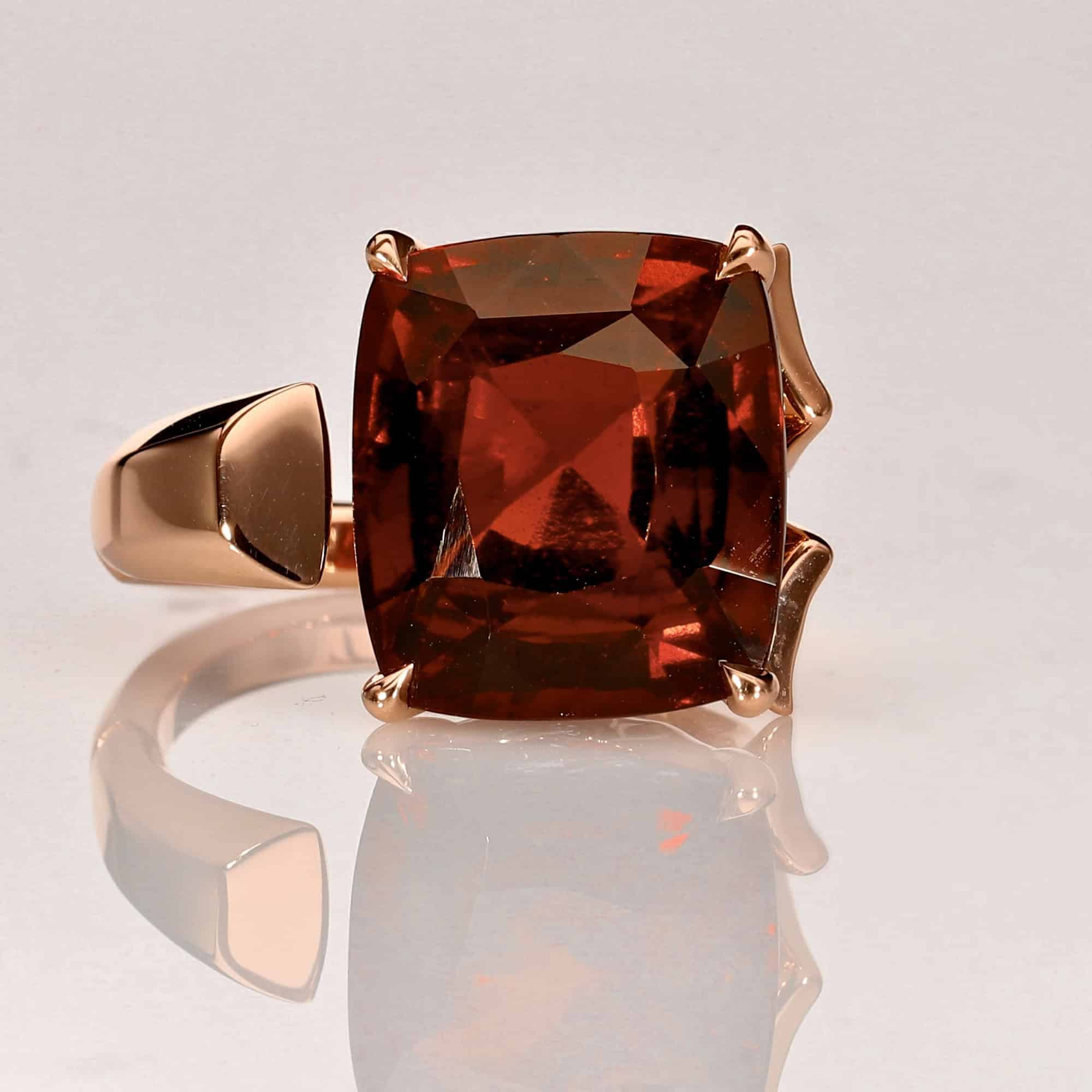
Terracotta, with its earthy warmth, has long been on the fringes of the neutral palette. Once considered merely an “accent”, it has gracefully transitioned into the realm of “staples”. Its resilience and adaptability have been showcased time and again, as designers globally have embraced and celebrated it in their creations.
Initially pigeonholed for its “bohemian” vibe, terracotta has shattered those confines. Today, it stands tall as a multifaceted hue, harmonising effortlessly with a spectrum of colours. Its rich, warm undertones make it a favourite for those seeking a touch of natural elegance.
For those keen on incorporating this enduring shade into their jewellery collection, Hessonites and select Bi-Tourmalines offer the quintessential terracotta hue. Dive into the world of terracotta, and discover a neutral that’s both timeless and contemporary.
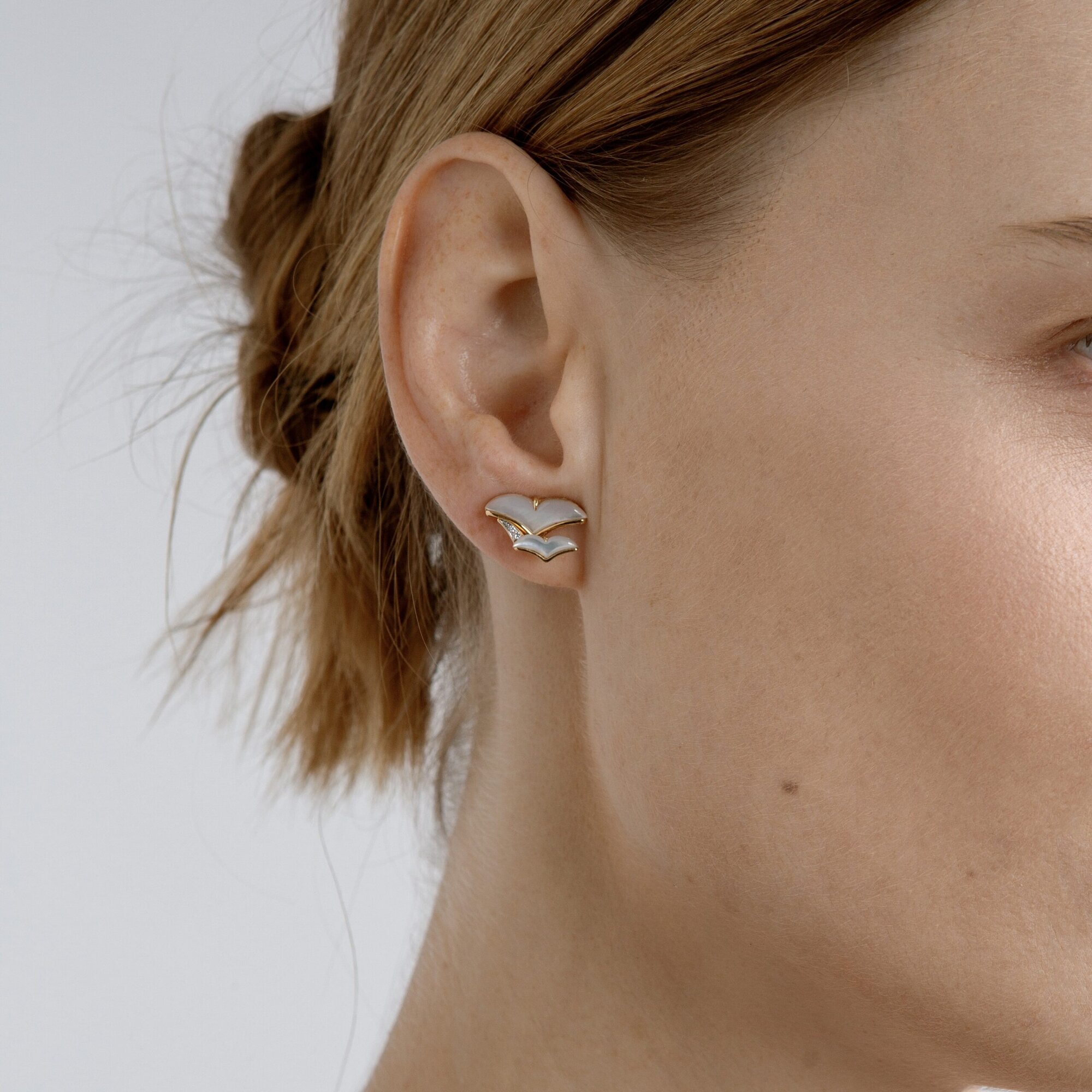
Blush Pink: The New Neutral
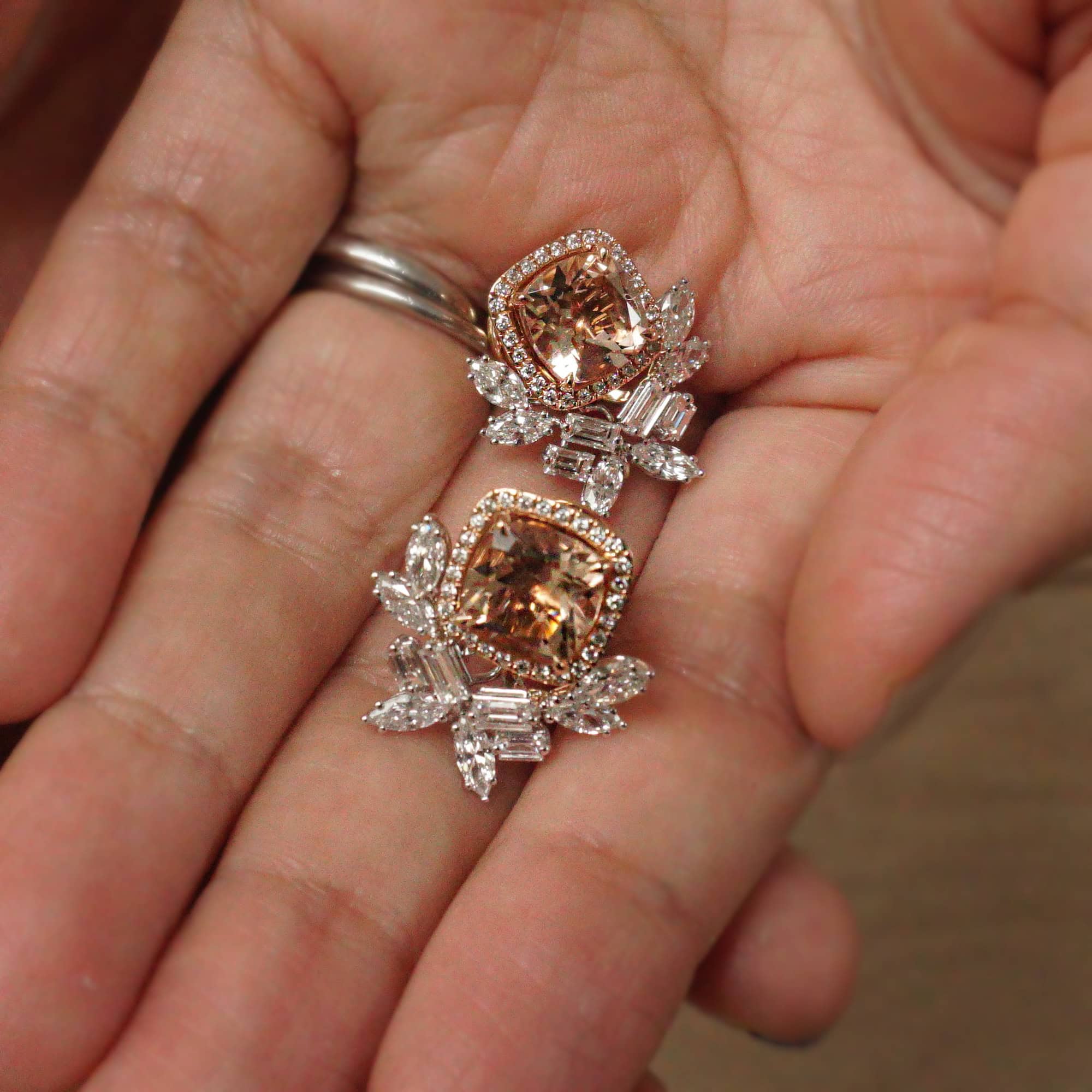
Historically, pink has often been viewed as a bold, statement colour. However, let’s shift our focus to blush pink, a hue that rivals the versatility of classic beige. Enter Morganites, with their captivating muted grapefruit shade, ideal for everyday wear. While they offer a hint more intrigue than a colourless gem, they effortlessly complement various palettes.
This subtle shade of pink has transitioned from being just another colour to what we now recognise as a “core colour”. In essence, blush pink has earned its rightful place in the neutral spectrum, proving that neutrals can be both understated and captivating.
Dark Champagne & Earthy Elegance: The Subtle Depth
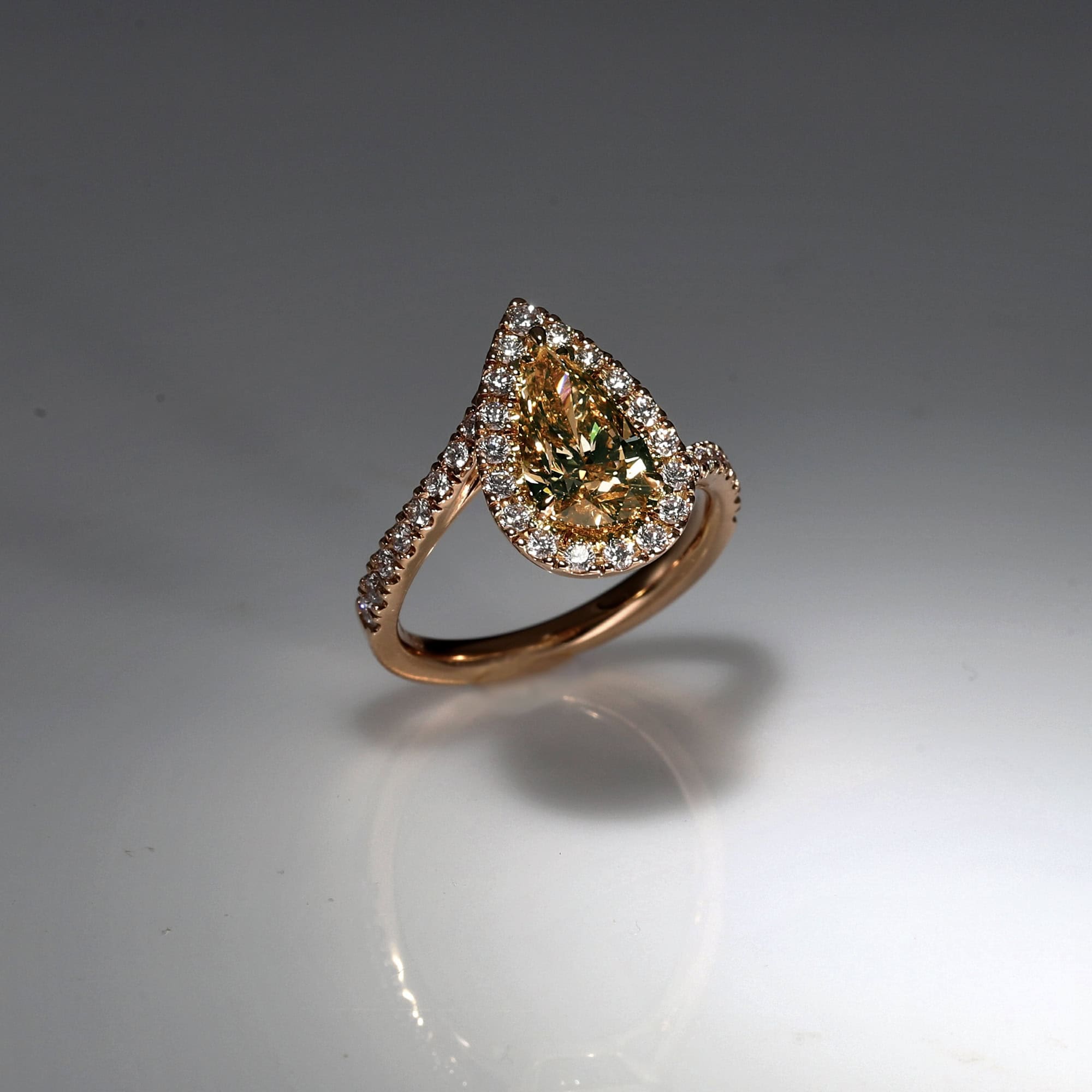
If you’re aiming to infuse warmth and depth into your ensemble without veering towards the intensity of a shade like chocolate brown, this is your ideal pick. This hue offers just the right amount of moodiness, yet its earthy undertone ensures it pairs seamlessly with a range of complementary colours. The perfect embodiment of this sophisticated balance? Brown diamonds. They stand as a testament to understated elegance, proving that sometimes, subtlety speaks volumes.
The Allure of Neutral Gemstones
Neutral gemstones serve as the perfect backdrop, allowing your creative flair to shine in other aspects, making them an essential addition to any jewellery enthusiast’s collection.
Picture this: your wardrobe is filled with vibrant, colourful outfits. In such a scenario, it’s logical to invest in gemstones that are versatile in hue, ensuring there’s no risk of a colour clash.
Beyond this, there are days when simplicity is the key. Opting for neutral gemstones can streamline your morning routine, eliminating the need for the often time-consuming colour coordination debate.
But it’s not just about convenience. Neutral gemstones offer a visual treat, providing a touch more intrigue than the standard colourless diamond. They effortlessly infuse sophistication and depth into any ensemble, proving that the right neutral is far from mundane.
Moreover, neutral gemstones provide a foundation upon which you can layer accent colours or introduce bold design elements, allowing for endless customisation.
In Conclusion
Both interior and fashion designers frequently turn to neutral palettes, leveraging them to create a range of visual effects. They play with focus, saturation, and contrast to accentuate specific features.
Knowing your skin’s undertone can be a helpful guide in selecting the most complementary gemstone. However, it’s essential not to be confined by this knowledge. Consider the gemstone’s shape, texture, and distinctive design. When a piece resonates with you or holds sentimental value, traditional guidelines fade into the background. Trust your instincts and let them lead you to your ideal gemstone.