A pink sapphire paired with orange garnets makes a different statement from a ring built around several shades of green. One combination relies on contrast; the other on variation within a colour family. Both can work, but the success of a multi-gem ring depends on how its gemstones relate to one another: in colour, proportion, shape and the way they are set.
The challenge is not necessarily to make every gemstone match. It is to understand what each one contributes, then decide which differences to emphasise and which to bring into harmony.
1. Look beyond the colour name
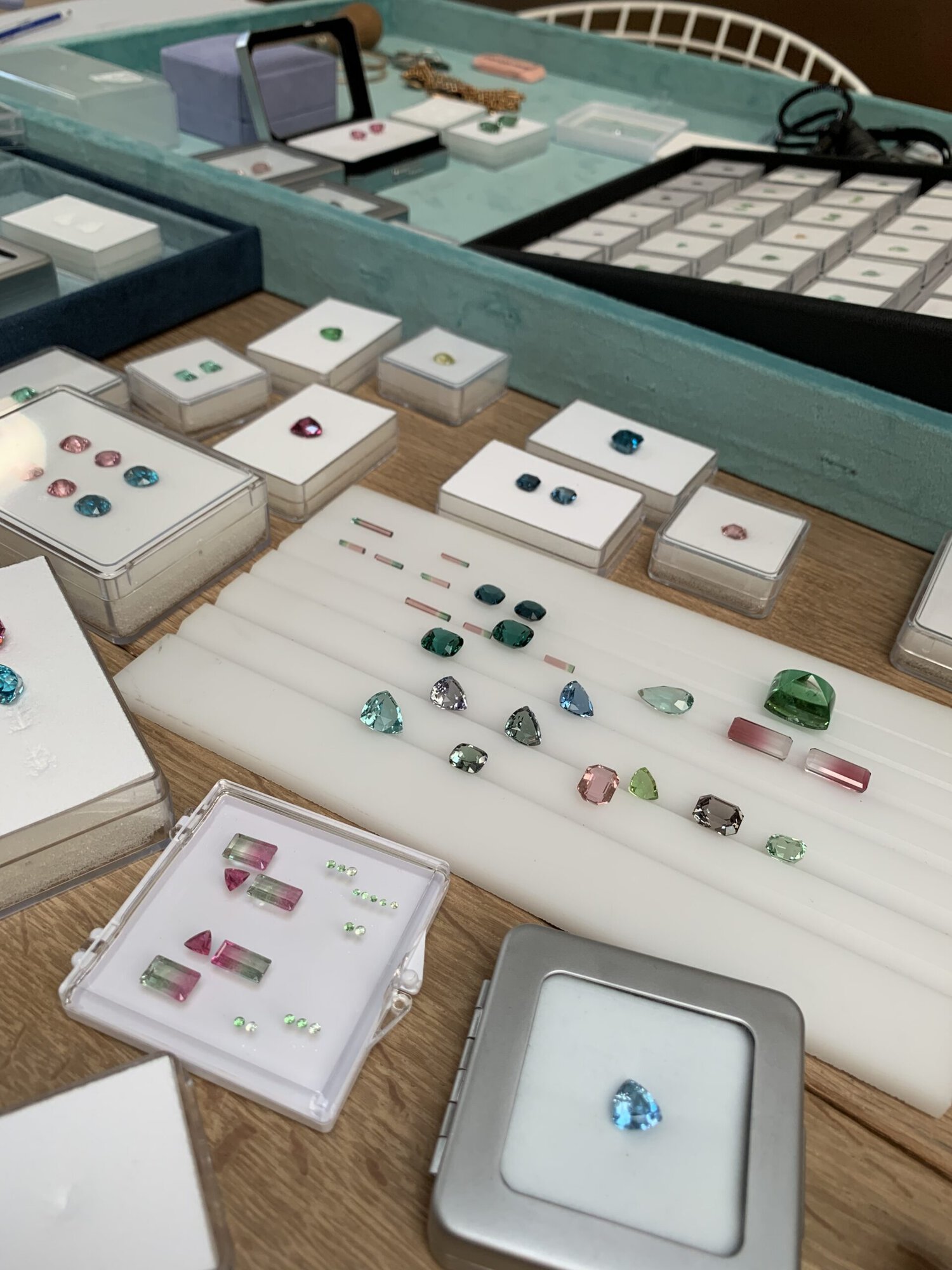
Two gemstones described as green can look markedly different beside one another. One may have a yellow undertone and a bright appearance; another may be cooler, darker or more subdued. Three aspects of colour help explain these differences: hue, tone and saturation.
Hue is the colour itself, such as blue, green or red. Tone describes how light or dark it appears. Saturation refers to the intensity of the colour, from muted to vivid.
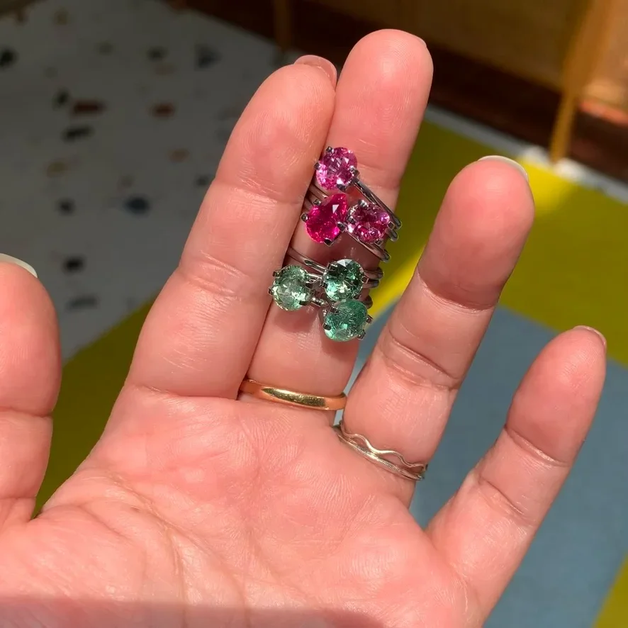
These distinctions help when comparing gems within the same colour family. A vivid emerald beside a pale green peridot creates a marked difference in intensity, while two similarly saturated green gems can produce a more continuous effect. Neither approach is inherently preferable. The choice depends on whether the design calls for contrast or a more even distribution of colour.
Colour can also vary within an individual gemstone. Some varieties are pleochroic, displaying different colours or colour intensities according to the direction from which they are viewed. Others may have uneven colour distribution, with some areas appearing more saturated than others. These are distinct characteristics, and both can affect the appearance of a gem once it is set.
2. Choose a palette: harmony or contrast
Once you have assessed the individual colours, the colour wheel offers a useful way to explore how they might work together. Three approaches are particularly helpful: analogous, complementary and monochromatic palettes.
Analogous colours sit close together on the wheel. Blue, blue-green and green, for example, can form a connected palette. Aquamarine, teal tourmaline and emerald could create this effect, although the precise result would depend on their individual hues and saturation. A dark, strongly saturated emerald may dominate paler companions; a lighter one may allow the colours to flow more evenly.
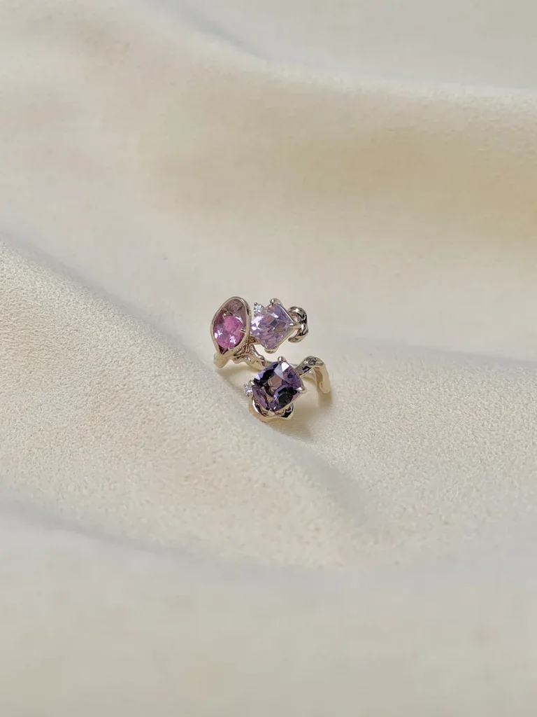
Complementary colours sit opposite one another on the wheel. Blue and orange are a familiar pairing, with the contrast making each colour more conspicuous. Their proportions matter: a small orange accent beside a larger blue gemstone introduces a different emphasis from two similarly sized gems sharing the attention.
A monochromatic palette uses variations of one colour. Several shades of green, for instance, can create depth without introducing a contrasting hue. Differences in tone and saturation help the individual gemstones remain distinguishable, while changes in shape can add further variation.
These approaches provide different starting points for a design. The useful question is whether the selected gemstones produce the relationship you want when viewed together, not simply whether their colour names fit a category.
3. Use proportion to establish a focal point
In a ring containing several gemstones, relative size and placement influence where the eye goes. A central gem can anchor the composition, while smaller gems flank it or introduce contrasting colours. Carat weight alone, however, does not determine how prominent a gemstone will appear.
One documented design pairs a 2.08-carat oval pink sapphire with two spessartine garnets weighing 3.41 carats combined. The sapphire’s pink contrasts with the garnets’ vivid orange, and their placement on either side establishes a clear centre.
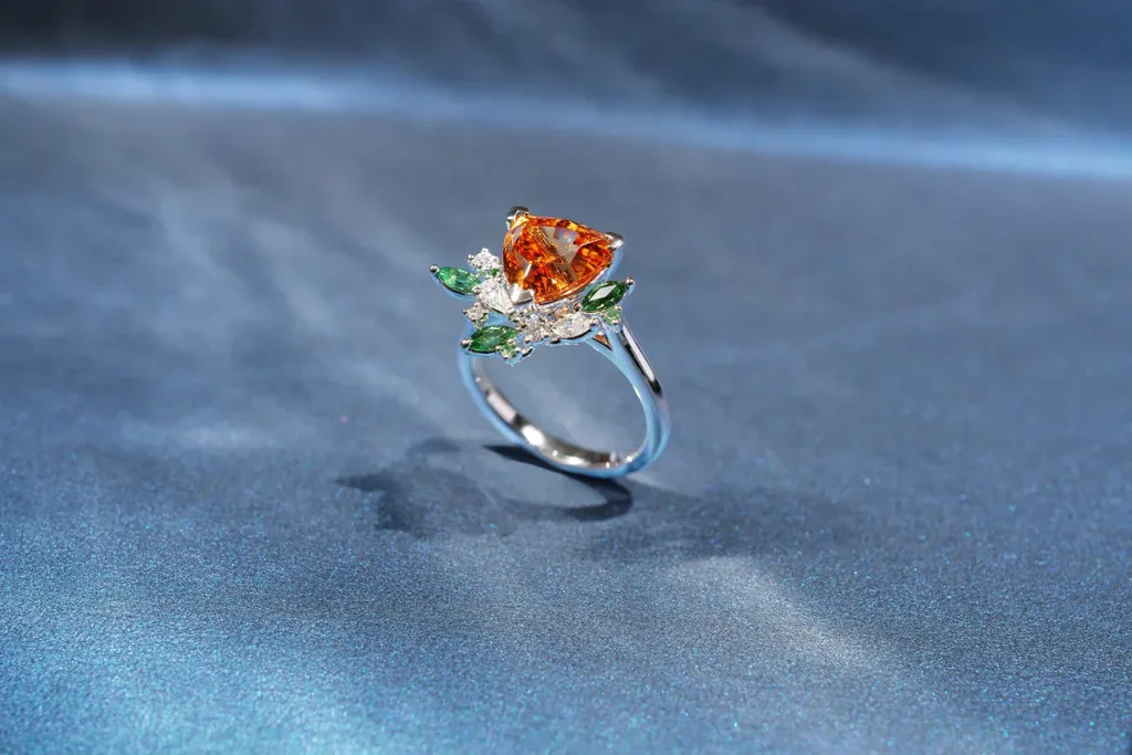
The garnets have approximately 1.64 times the combined carat weight of the sapphire. That does not mean they occupy 1.64 times as much visible space. Carat measures weight, and different gemstone materials have different densities. Shape and face-up dimensions also affect apparent size, so the weights alone cannot establish the relative area the gems occupy when viewed from above.
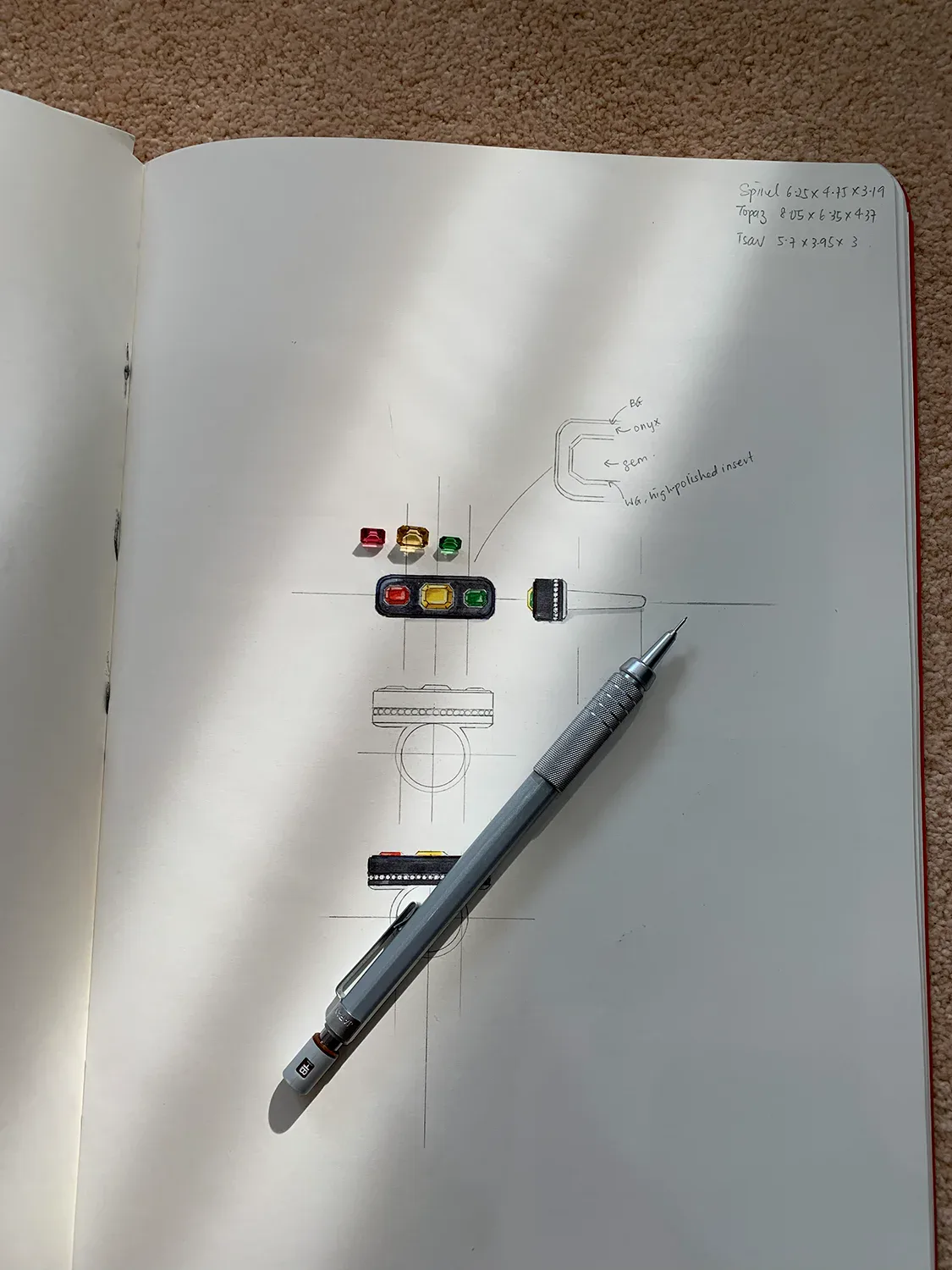
A second documented ring takes a different approach. It features a 9.05-carat bi-coloured tourmaline set with yellow diamonds, tsavorites and rubellites. The central tourmaline already contains two colours; the surrounding yellow, green and red gemstones introduce additional hues. The design therefore brings together variation within one gemstone and contrast between separate gems. When choosing a bi-coloured centre, the colours visible in the tourmaline itself are part of the palette, not a separate consideration.
These examples also show why the largest gemstone by weight need not be the only one that attracts attention. Colour intensity, position and the relationship between neighbouring gems all contribute to visual emphasis.
4. Let shape and cut influence the design
The outlines of gemstones give a ring its visual rhythm, while their cuts influence how they handle light. Both affect how a group of coloured gems reads as a whole.
A row of oval gemstones creates a regular pattern. Introducing a pear-shaped or square gem changes that pattern, giving the eye a different outline to follow. Round, oval, cushion, pear and emerald cuts each have a distinct shape and set of proportions. Combining them can create variation, but the outlines need to relate to one another within the available space.
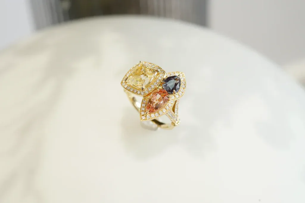
Cut also affects brightness, contrast and visible colour. Facet arrangement and proportions influence how light travels through a gemstone, so two gems of the same variety and similar colour may still look different when placed together. A gemstone that appears vivid from one direction may look different when tilted.
Pleochroism adds another consideration for varieties that display it. Because the apparent colour can change with viewing direction, the orientation of the gemstone during setting may affect which colour is most visible to the wearer.
Clarity can influence the appearance of a combination, too. Coloured gemstones do not share one universal clarity grading scale, and inclusions are common in many natural varieties. Their significance depends on the gem, their visibility and their effect on transparency. Two emeralds, for example, may differ substantially in appearance even if both are described as green. Inclusions are not automatically a reason to reject a gemstone; they need to be assessed in context.
5. Consider the metal, setting and demands of wear
The metal surrounding a gemstone contributes to the overall colour relationship. Yellow gold can reinforce the warmth of red, orange and yellow gems, while white gold creates a cooler contrast that may suit blues, greens and purples. These associations are starting points, not rules. A warm metal can also bring warmth to a cooler palette, and the amount of visible metal affects how strongly it influences the design.
The setting has a practical role as well. It must secure the gemstones and accommodate their individual vulnerabilities, particularly in a ring that will be worn regularly. This makes durability an important part of gemstone selection.
Understanding gemstone hardness
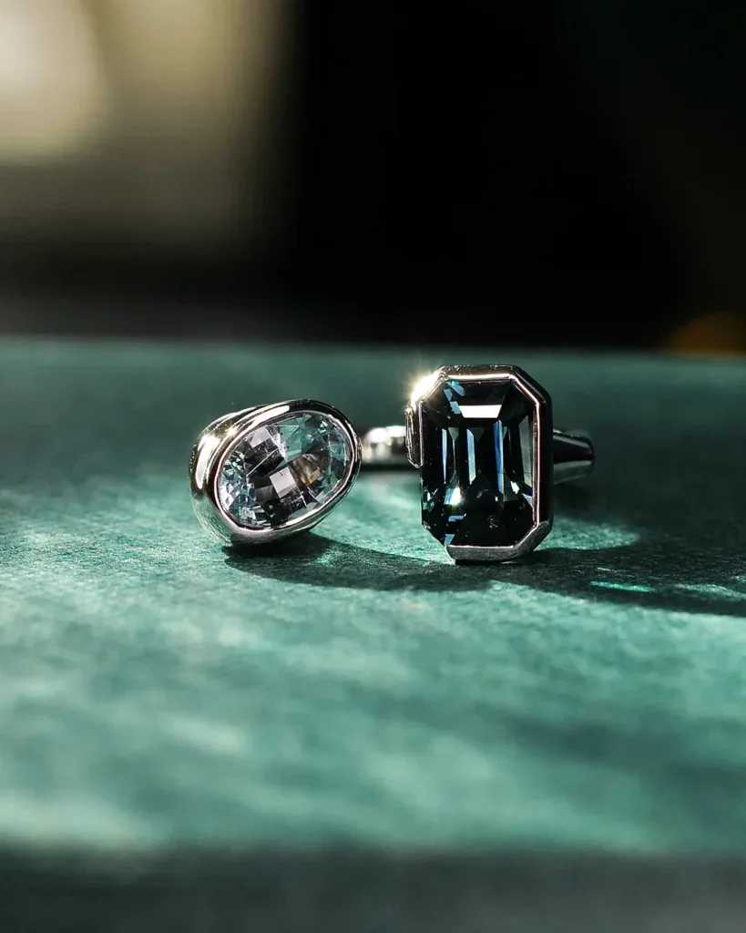
The Mohs scale measures resistance to scratching, ranking minerals from 1 to 10. Ruby and sapphire rank at 9, spinel at 8, and morganite at 7.5 to 8. Tourmaline and tsavorite garnet generally rank around 7 to 7.5, while emerald is rated at 7.5 to 8.
Hardness is only one measure of durability. Toughness, cleavage, fractures, inclusions and treatments can also affect how a gemstone withstands wear.
Emerald illustrates the distinction. Despite its relatively high hardness, it can be vulnerable to impact, particularly where inclusions and fractures are present. Many emeralds have surface-reaching fractures filled with oil, resin or other substances to improve apparent clarity. These treatments vary in stability and can affect care requirements, so the treatment of an individual gemstone matters.
Opal needs particular care, too. Its hardness varies, and its toughness can be poor to fair. Heat and sudden temperature changes can also cause damage. An opal ring may therefore call for more protective design choices and more careful wear than a ring set with ruby or sapphire.
The setting can help protect vulnerable edges and reduce exposure to knocks. Its design should reflect the gemstones it holds and how the wearer intends to use the ring. A piece intended for frequent wear may require different choices from one reserved for occasional use.
6. Make room for personal meaning
Colour and appearance are not the only reasons to combine gemstones. A wearer might choose a particular palette, include an inherited gem or select several varieties for their personal significance. Family rings are one example: each gemstone may represent a parent, child, sibling or another loved one, and the selections need not match.
The use of gemstones to convey a message has a long history. Victorian acrostic rings used the initial letters of gemstones to spell a word. One documented example contains ruby, emerald, garnet, amethyst, ruby and diamond, spelling “REGARD”. The sequence gives the selection a meaning beyond the individual colours and the ring’s appearance.
Contemporary bespoke rings can express personal connections in many ways. The challenge is to preserve the choices that matter to the wearer while finding an arrangement that works as a piece of jewellery.
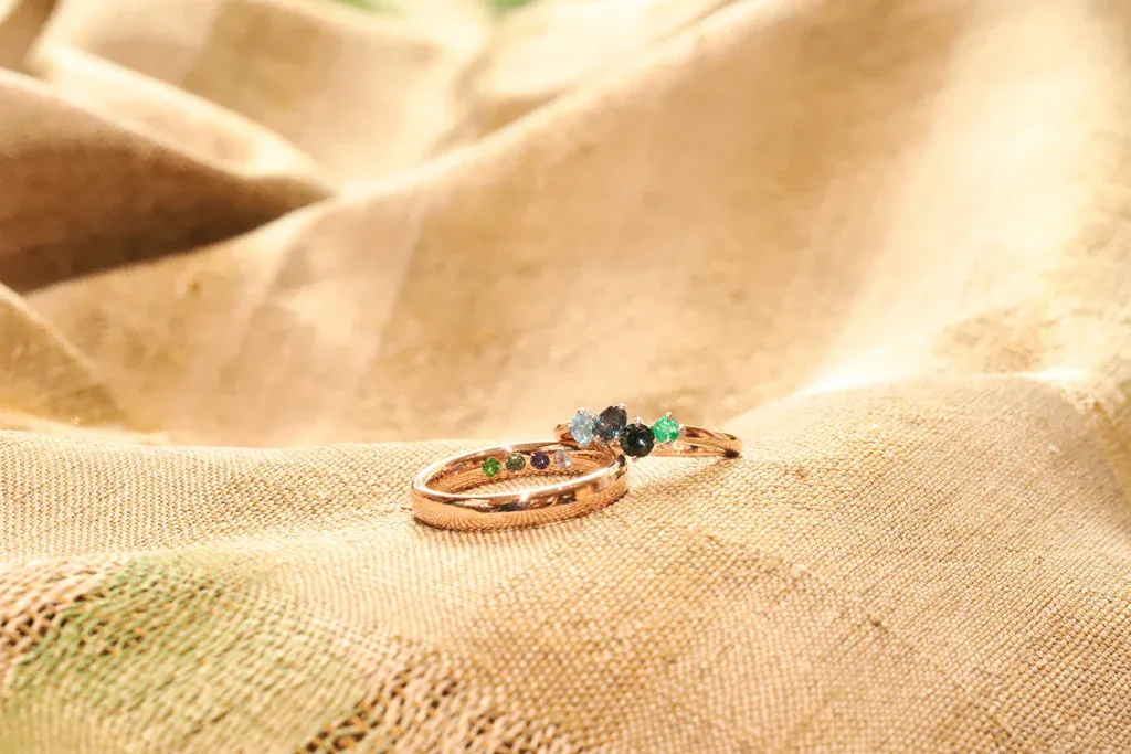
Family rings are one of Calla Lily Fine Jewellers’ specialties. Our designers work closely with clients to translate personal preferences into a design, helping them consider which gemstones can be combined and how their differences can be accommodated.
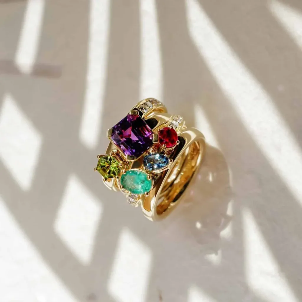
Our bespoke family ring featuring amethyst, peridot, emerald, ruby and aquamarine brings five different gemstones into one piece, each with its own colour and shape. It illustrates one way to bring individually selected gems together without requiring them to match.
Commissioning a bespoke multi-gem ring
Whether you are drawn to contrasting colours, variations within one palette or gemstones chosen for personal reasons, the design begins with the selection of gems that suit your preferences and intended wear.
At Calla Lily Fine Jewellers, we create bespoke multi-gem rings, including family rings, with close attention to the relationship between the gemstones and the practical requirements of the finished piece.